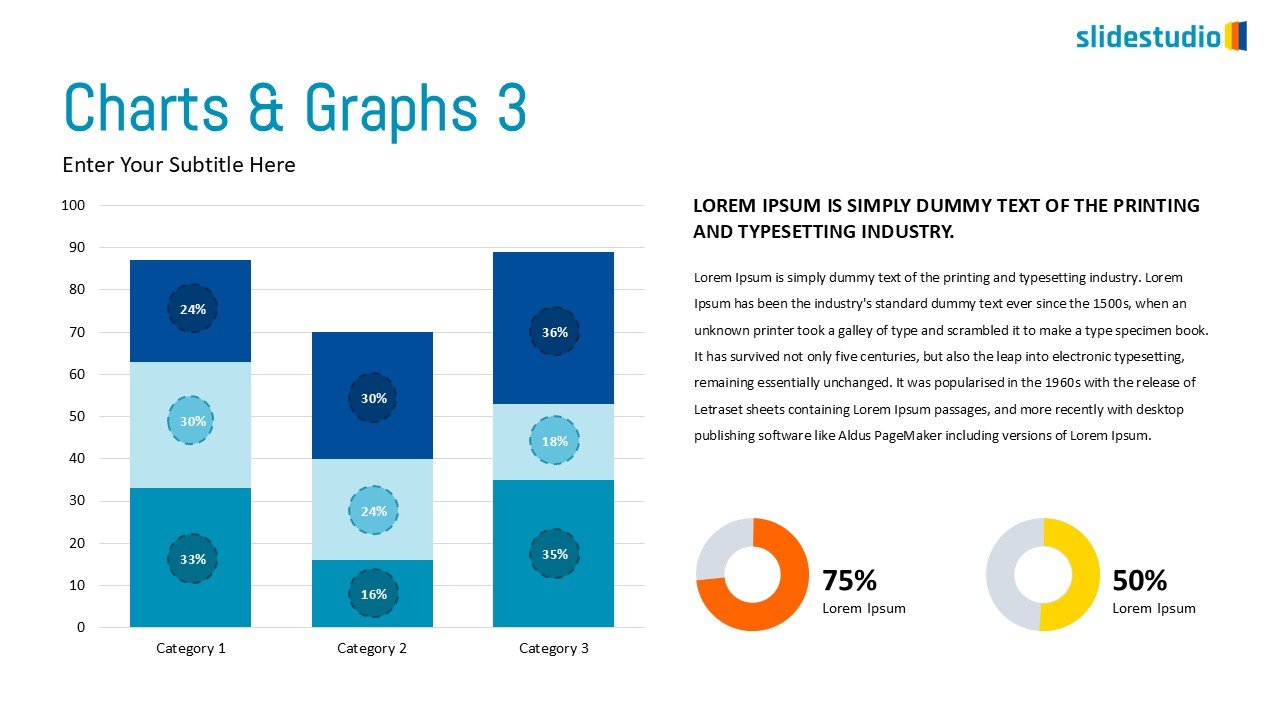
This comprehensive slide combines multiple data visualization elements to present a robust overview. On the left, a stacked bar chart illustrates three categories, with each bar segmented into distinct percentages using varying shades of blue, providing a clear breakdown of composition. On the right, a large text block offers space for detailed explanations or narrative. Below the text, two donut charts visually represent key metrics: 75% in orange and 50% in yellow, offering a quick grasp of proportional data. This slide is perfect for presenting complex data sets, showcasing contributions to a whole, and providing both granular and summary insights in business reports, analytics presentations, or academic studies.
A detailed answer to provide information about your business, build trust with potential customers, or help the visitor with a problem they may be encountering
A detailed answer to provide information about your business, build trust with potential customers, or help the visitor with a problem they may be encountering
A detailed answer to provide information about your business, build trust with potential customers, or help the visitor with a problem they may be encountering
A detailed answer to provide information about your business, build trust with potential customers, or help the visitor with a problem they may be encountering
A detailed answer to provide information about your business, build trust with potential customers, or help the visitor with a problem they may be encountering
A detailed answer to provide information about your business, build trust with potential customers, or help the visitor with a problem they may be encountering
A detailed answer to provide information about your business, build trust with potential customers, or help the visitor with a problem they may be encountering
A detailed answer to provide information about your business, build trust with potential customers, or help the visitor with a problem they may be encountering
Customer Reviews
“A review from a customer who benefited from your product. Reviews can be a highly effective way of establishing credibility and increasing your company's reputation.”
Customer Name
“A review from a customer who benefited from your product. Reviews can be a highly effective way of establishing credibility and increasing your company's reputation.”
Customer Name
“A review from a customer who benefited from your product. Reviews can be a highly effective way of establishing credibility and increasing your company's reputation.”